
When we upgrade AsULearn in mid-May one of the areas I think will be a huge improvement for both our faculty and student is the dashboard.
Currently our dashboard looks like the following, with courses organized by three categories (In progress, Future and Past).

There is little a user can do to customize the way their courses are organized. Even worse if you have many courses in a category, there is no way to prioritize the display of the courses.
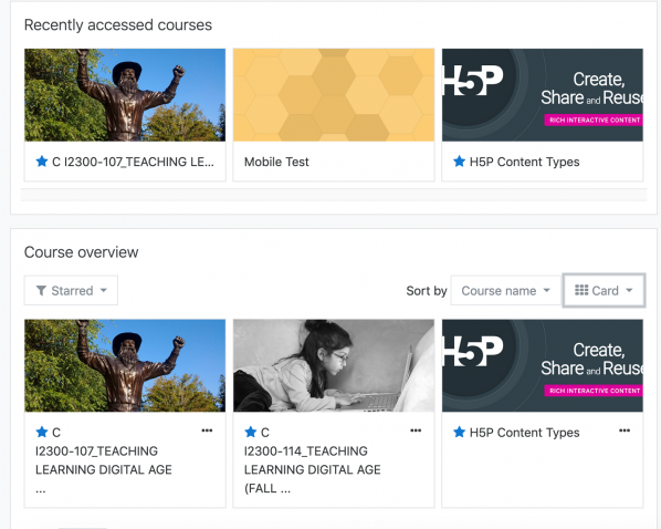
With the upgrade, the user will be able to filter what courses to display. You can also “star” courses and see the last courses accessed. After the upgrade, your dashboard will look like the following.

Notice the courses now have course images associated with them, which I discovered was useful when working with the new AsULearn mobile app. Even if you’re not using the app, you might want to explore some options for the course summary image, and I have created a short video here for more details on setting up this image.
While these are minor adjustments in Moodle, we feel these tweaks to the dashboard will be a real improvement for our students, staff and faculty using AsULearn.
It’s always nice when an upgrade feels like an upgrade.

dashboard soon
Dashboard upgrade